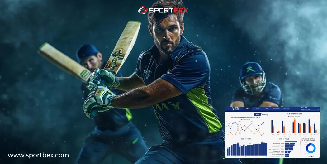
Cricket is a fast-changing game where every ball can impact the result. Real-time analysis helps users stay updated with every moment of the match without delay. Cricket data visualization makes this process simple by presenting data through clear and easy visuals.
With Live Cricket Data Visualizations, users can track run rates, partnerships, and player performance instantly during the match. This makes the experience more engaging and interactive. It also helps users understand the game better without confusion.
Real-time insights rely on the importance of sports data feeds that deliver continuous match updates. This keeps visuals accurate and up to date. It makes Cricket Data Visualizations for Real-Time Score Analysis more reliable and effective.
For platforms, tools like Sports Data API and Cricket Ball by Ball Live API provide accurate and fast updates for every delivery. This improves overall system performance and ensures smooth data flow. It also builds strong user trust and reliability.
What Are Cricket Data Visualizations?
Cricket data visualization is the process of presenting cricket data using visual formats like charts and graphs. Instead of going through large sets of numbers, users can quickly understand patterns through sports graphs and dashboards.
This approach is part of data visualization in sports, where complex data is converted into simple visuals. It helps both beginners and experts understand match situations without confusion.
For example, instead of only seeing a player’s score, cricket data visualization graphs can show how runs were scored across overs or against specific bowlers. This level of detail improves analysis and decision making.
Modern platforms use tools like Cricket API to fetch and display this data in real time. These systems ensure accuracy and provide users with reliable insights throughout the match.
Why Real-Time Score Analysis Matters
Cricket is a fast-changing game where every ball can impact the result. Real-time analysis helps users stay updated with every moment of the match without delay. Cricket data visualization makes this process simple by presenting data through clear and easy visuals. With Live Cricket Data Visualizations, users can track run rates, partnerships, and player performance instantly during the match.
This makes the experience more engaging and interactive. It also helps users understand the game better without confusion.Real-time insights are powered by the importance of sports data feeds, which continuously deliver match data without interruption.
These systems ensure that every update is accurate and timely. This keeps visuals aligned with the latest match situation. For platforms, tools like Cricket Ball by Ball Live API provide accurate and fast updates for every delivery. This improves overall system performance and ensures smooth data flow. It also builds strong user trust and reliability.
Benefits of Using Real-Time Data Visualizations
Using cricket data visualization offers multiple advantages across fans, teams, and developers. It goes beyond simple visuals and helps in better understanding of the game. It also delivers real value through clear insights and improved decision making.
Enhances Fan Engagement
Interactive sports graphs help fans understand the game in a more detailed way. Instead of just checking scores, they can follow match progress visually. Cricket data visualization graphs make every moment more engaging and easy to follow.
Fans can explore player stats, partnerships, and match trends without confusion. This creates a deeper connection with the game and improves overall viewing experience. It turns passive watching into an interactive and enjoyable activity.
Provides Insights for Better Strategies
Teams use sports data visualization to make smarter and faster decisions during matches. By analyzing performance through visuals, coaches can understand player strengths and weaknesses clearly. This helps in planning better strategies.
Real-time insights allow quick adjustments in batting order or bowling plans. It gives teams a strong competitive edge by using accurate data. Cricket data visualization supports better decision making under pressure.
Improves App/Website User Experience
Platforms using cricket data visualization provide a cleaner and more engaging user experience. Visual dashboards make it easier for users to access important information quickly. Features like Live Cricket Score Widget help deliver real-time updates in a simple and interactive format.
Features like live score widgets and interactive sports graphs add more value to the platform. Users can track matches without confusion and enjoy smooth navigation. This increases user retention and satisfaction.
Helps Developers Build Smarter Platforms
Developers can build advanced tools using APIs like Cricket Live Line API for real-time updates. These tools help create interactive dashboards and smart applications. It improves the overall quality of the platform.
With cricket data visualization, developers can also add predictive features and deeper insights. This makes applications more powerful and useful for users. It also highlights strong technical capabilities and innovation.
Types of Cricket Data Visualizations
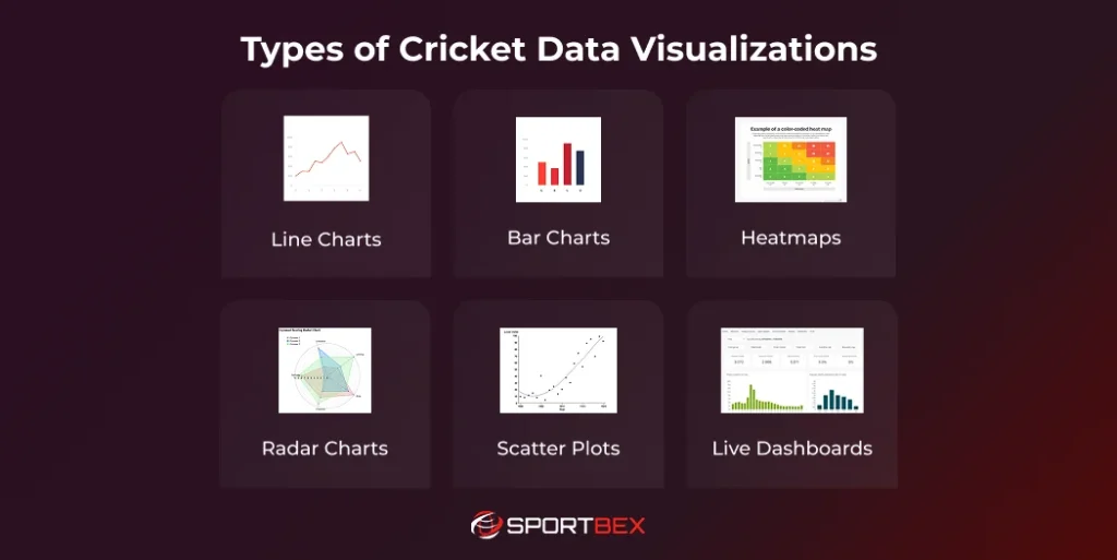
Different types of visuals are used depending on the analysis required in cricket. Cricket data visualization includes various formats like charts and graphs to present data clearly. Each type helps users understand match performance, trends, and insights more effectively.
Line Charts
Line charts are used to show how match data changes over time in a clear and simple way. In cricket data visualization, they are commonly used to track run rates and match progress. These sports graphs help users understand how the game is moving and where momentum shifts happen.
- Identify turning points in the match
- Track run rate over each over
- Compare team performance during innings
Bar Charts
Bar charts are helpful for comparing player and team performance quickly. They are widely used in sports data visualization to present stats in an easy-to-read format. These charts make cricket data visualization graphs more clear and effective for quick analysis.
- Analyze player stats side by side
- Compare top run scorers or bowlers
- Show runs scored in each over
Heatmaps
Heatmaps use color patterns to show data concentration on the field. In cricket data visualization, they are useful for analyzing bowling areas and batting zones. These visuals help users understand patterns that are hard to see in raw data.
- Identify strong and weak zones
- Show bowler’s pitch accuracy
- Highlight batsman’s scoring areas
Radar Charts
Radar charts display multiple performance metrics in one visual. They are useful in sports graphs for comparing players across different parameters. This type of data visualization in sports helps identify strengths and weaknesses easily.
- Identify balanced vs weak areas
- Compare batting or bowling performance
- Analyze multiple stats together
Scatter Plots
Scatter plots show the relationship between two variables in a visual format. In cricket data visualization, they help identify trends and patterns in performance data. These charts are useful for deeper analysis in sports data visualization.
- Discover hidden trends in data
- Analyze speed vs swing relationship
- Identify performance patterns
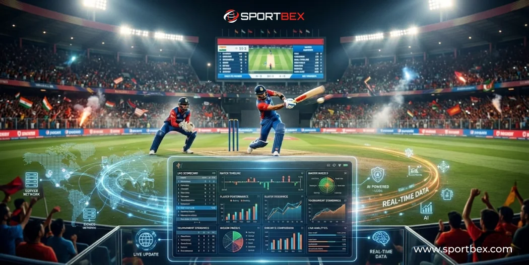
Live Dashboards
Live dashboards combine multiple visuals into one interface for real-time analysis. They are an important part of Live Cricket Data Visualizations and show match updates instantly. With tools like Live Cricket Score Widget and Cricket Ball by Ball Live API, these dashboards provide fast and accurate updates.
- Provide full match overview instantly
- Display real-time scores and stats
- Combine multiple sports graphs
Key Features of Cricket Data Visualizations
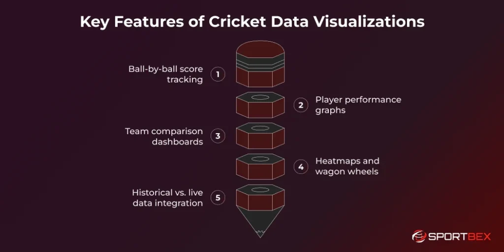
Effective cricket data visualization depends on strong features that simplify complex data. It helps turn detailed match information into clear and easy visuals. This makes analysis faster, more accurate, and useful for all users.
Ball-by-Ball Score Tracking
This feature shows match progress in real time with clear updates. Users can follow every ball easily through visuals. It helps in understanding how the game changes quickly during play. Cricket data visualization makes each moment simple to read.
Player Performance Graphs
These graphs can also highlight power-hitting metrics such as Sixes in Women’s T20, helping users understand a player’s impact in shorter formats. They help break down performance clearly for better understanding. Cricket data visualization graphs show batting and bowling trends in detail. This makes analysis more useful and accurate.
Team Comparison Dashboards
Dashboards compare both teams using clear and interactive sports graphs. They show run rates, partnerships, and match progress.This helps users quickly understand which team is performing better. It also highlights match momentum in a simple way.
Heatmaps and Wagon Wheels
Heatmaps show bowling accuracy using color patterns across the pitch. They highlight where the ball is delivered most often. Wagon wheels show batting areas and scoring zones clearly. This improves understanding of player behavior and strategy.
Historical vs. Live Data Integration
Combining past and live data adds more depth to analysis. It helps compare current performance with previous match records. This improves prediction accuracy and decision making for teams. It also connects with evolving Sports Technology Trends.
Tools and Technologies for Cricket Data Visualization
Building cricket data visualization systems requires the right tools and technologies. These tools help collect, process, and present data in a clear visual format. They ensure accurate insights and smooth performance for users across platforms.
Cricket APIs
Cricket APIs are the backbone of real-time systems in cricket data visualization. They provide match data, player stats, and ball-by-ball updates in structured formats like JSON. Tools like Sports Data API ensure fast and reliable data delivery. This helps platforms maintain accuracy and consistency across all visualizations.
Visualization Libraries
When it comes to showing cricket data in a cool way, visualization libraries are super helpful! Python tools like Matplotlib and Plotly, or R tools like ggplot2, are often used to make awesome cricket data visualization graphs. These tools are famous for making beautiful graphs that look great in reports and help everyone understand tricky data easily.
AI & Machine Learning
AI and machine learning enhance cricket data visualization by identifying patterns and generating predictions. These technologies analyze large datasets to provide deeper insights into player and match performance. They also help improve decision making through smart analytics. Some platforms integrate an Odds API Provider to include probability-based insights.
Cloud Platforms
Cloud platforms support data storage, processing, and real-time delivery for visualization systems. They ensure smooth performance even during high traffic matches or tournaments. This makes cricket data visualization reliable and scalable for large audiences. Cloud technology also helps maintain speed and system stability across platforms.
The Future of Cricket Data Visualizations
The future of cricket data visualization is becoming more advanced with modern technologies. It is moving beyond simple charts into more interactive and dynamic experiences. This makes data easier to understand for both fans and professionals.
New technologies like AR and VR are changing how users interact with cricket data. Fans may experience matches with real-time overlays and interactive dashboards. This creates a more engaging and visually rich experience.
AI-driven systems are improving sports data visualization by offering predictive insights and deeper analysis. These systems analyze performance and match conditions more accurately. This helps teams make better decisions and improves overall understanding.
- Advanced interactive dashboards for deeper analysis
- Real-time AR overlays for live match insights
- VR-based immersive match experiences
- AI-powered match and player predictions
Get a Ready-Made Platform On Rent.
Get Started TodayConclusion
Cricket is a data-driven sport where every detail matters in understanding the game. Cricket data visualization transforms complex data into simple and meaningful insights. It helps fans, teams, and developers understand performance clearly and make better decisions.
From sports graphs to Live Cricket Data Visualizations, these tools improve engagement and decision making across platforms. They allow users to follow matches with deeper insights and clarity. With modern APIs, real-time analysis has become more accessible and effective.
As technology continues to grow, cricket data visualization will become even more powerful and advanced. It will shape the future of cricket analysis with smarter insights and better tools. This will create a more connected and interactive experience for everyone.
Frequently Asked Questions
Live cricket analysis uses Real-Time Cricket Data API to capture ball-by-ball data, which is displayed in dashboards and visualizations for instant insights during the match.
APIs like Sports Data API, Sports Data Feeds, and Real-Time Cricket Data API deliver live scores, player stats, and match analytics for real-time updates and analysis.
Sports graphs display player performance, team comparisons, scoring trends, and match progress, helping analysts and coaches make better decisions quickly.
Yes, fans can track matches live, view player stats, and compare historical performance using dashboards and widgets like Cricket Score Widget for interactive insights.
Real-time data helps coaches make strategic decisions, enhances fan engagement, and allows apps or websites to provide live, interactive insights for matches.
Recent Blog


Top 10 Best Indian Football Players Of All Time
June 1, 2026
Worldwide Real-Time Cricket Scores API with Fast Updates
May 25, 2026